
When it comes to sharing or increasing access to data, there is a wide range of different approaches out there and finding the most suitable approach can be tricky. We’ve created the Data Access Map to help people and organisations explore the various options and navigate this difficult terrain.
From APIs and blockchains to competitions and data trusts, there are many different approaches that people can take to sharing or increasing access to data. So many, in fact, that it can be difficult to understand the full range of approaches or weigh the benefits and limitations of each. This in turn can make it difficult for us – as data holders, users, researchers, regulators and policymakers – to identify which approach best suits our needs.
At the ODI, we’ve embarked on a journey to research, map and describe the various data access approaches out there in the hope that we can help people and organisations to navigate this vast landscape. While some of that work has focused on particular approaches, such as data trusts and open data, we have the wider goal of helping people and organisations understand, compare and adopt the right approach for them.
This work is part of a three-year innovation programme, running to March 2020 with a funding profile of £2m each year from Innovate UK, the UK’s innovation agency. Through our R&D programme, we aim to shape future services and promote productivity and growth with cutting edge expertise.
Explore the Data Access Map
We’d love to hear your feedback
Share your feedback on our new Data Access Map, and help us make it an accessible, accurate, clear and useful tool for others.
Use The Data Access Map
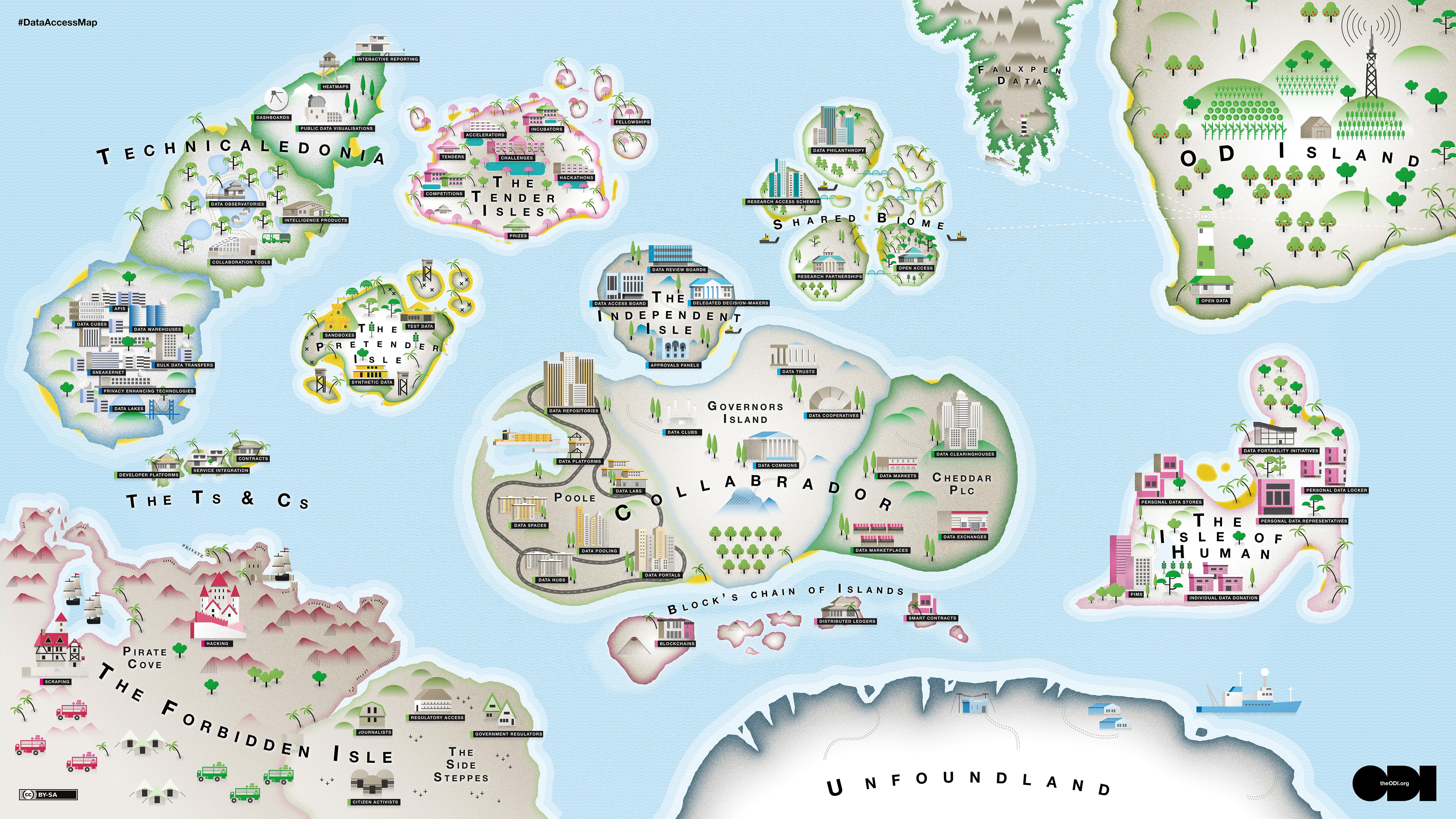
We’ve created what we call ‘The Data Access Map’ as part of our efforts to help people make sense of the complex world of data access and data sharing. The map helps to navigate the range of different data access approaches being used and spoken about, and the variety of terms being used to describe them.
It is a difficult challenge, but one we think is important and, much like the high seas in the sixteenth century, worthy of exploration.
You can freely copy and use these images in any media (they are CC-BY licensed).
All graphic illustrations were illustrated by Ian Dutnall of Icographic.
What's next with the map?
We plan to develop a travel guide that explains our thinking for why certain approaches have been clustered together and gives descriptions of the different approaches with links to examples of each. We also plan to continue testing the Data Access Map with external people and organisations to understand their needs and how the map can meet them.
We want to continue our journey with the map in collaboration with others. If you are a data holder looking for guidance on the various data access options available to you, if you have thoughts on how to improve the map, or if you’d like to get involved in our work, get in touch with [email protected].
How we created the map
We began our research with a simple, two-part question: “Can we construct a taxonomy of data access approaches, and would such a thing be useful to data holders thinking about increasing access to data?” There is a range of different models out there for increasing access to data – some established, some less than established – so we set out to break those models down into their constituent parts and build them back up into groups based on shared attributes.