
Have we fallen out of love with bread? This World Food Day we show how visualising food data helped people understand consumption choices and trends over time

By Phil Lang, Jamie Fawcett and Ellen Broad
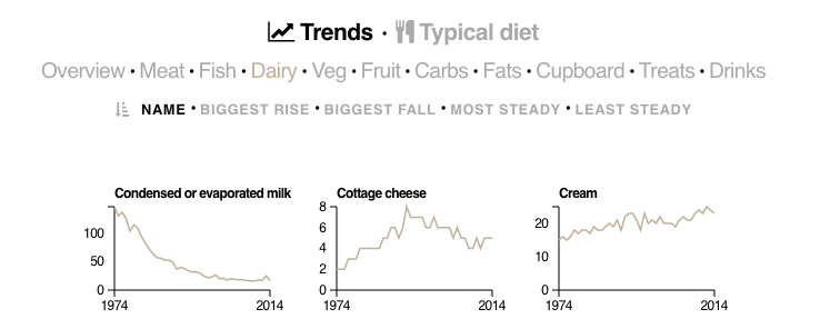
The UK’s Department for Environment, Food and Rural Affairs (Defra)’s food survey data, released in February this year, sketched a grand picture of British consumer eating habits.
The data was which in trends around consumption, and how the British diet had undergone a transformation in the last half-century. Traditional staples such as bread, eggs, potatoes and butter had gradually given way to more exotic or convenient foods, such as aubergines, olive oil and stir-fry packs.
However, such insights within datasets can be difficult to communicate to an audience who isn’t ‘data literate’.
In February 2016, the ODI published a data visualisation that explored British consumer eating and drinking habits from 1974 to 2014. The visualisation broke data down across a range of food types, both raw and processed, and visualised them as small multiples.
Using Defra's food survey data and data from the National Food Survey, the ODI worked in collaboration with a data visualisation company called Kiln to produce the visualisation.
How and why Defra opened more food data
In June 2016, Defra celebrated 12 months of #OpenDefra – their commitment to releasing 8,000 datasets as open data in one year. The pledge kickstarted a transition across the department to an open culture.
As part of this, Ellen Broad, then ODI's Head of Policy, was on secondment at Defra, assisting the Secretary of State as her expert adviser on data. During this time, the food and farming statisticians in Defra were encouraged to publish underlying diary data behind the long-running Family Food Survey as open data. This was entirely new for them – publishing the more granular data underpinning their annual official statistics – and not risk-free, but they rose to the challenge and tackled it in an open manner.
The Defra team were excited about the potential implications of making a dataset covering such an extensive period available in a reusable format for the first time. With support from Ellen – who was able to connect the team to anonymisation experts and open data reusers – the team navigated anonymisation questions and publication options. They wanted to share their excitement with potential users and the public more generally, to maximise the impact of the release. They knew they would have to tell an engaging story in order to do this.
Given the ODI’s commitment to demonstrating the value of open data and telling stories with open data, we felt like it was a perfect opportunity to get involved.
We enlisted the help of Kiln to help create a visualisation, to bring the story to wider audiences. The visualisation primarily focused on how trends had changed over time. We worked with Kiln to make it as simple and intuitive as possible – allowing people to use various filters helped them to explore the data and discover the trends they found interesting.
Response
The response to the visualisation was great. It was initially shared via social media platforms like Twitter and Facebook, but the engagement spiked when it was published to Reddit on the ‘Data is Beautiful’ SubReddit. Over a period of 48 hours, the visualisation had 30,000 unique users.
Before long, a series of digital publishers and blogs picked up the visualisation and repackaged it for their purposes.
- The slow death of the most British thing there is – Washington Post
- How Britain fell out of love with bread, sugar, meat and eggs – Mail Online
- Change in the British diet, since 1974 – Flowing data
- How Britain’s diet has changed over the last 40 years – Indy 100
It also inspired the creator of well-known data blog FlowingData to create an American equivalent of the visualisation, using the same style.
The visualisation reached an audience of 100,000 users between February and August 2016 on theodi.org, and many more across various digital publications.
You can see more of the visualisation's uses and features in this Storify.
This highlights the power of data visualisation in engaging broad audiences. If you’d like to learn how to visualise data, why not join our next Visualising Data Workshop on 8 November in London? If you book, you’ll receive a 50% discount code off our Finding and Preparing Data Workshop. Find out more and book here.
Screengrab: Britain's Diet in Data